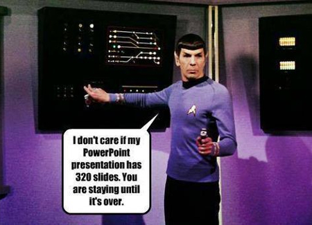
 As a business leader, you’re expected to make a presentation from time to time. This is where Microsoft PowerPoint comes in handy. However, if your PowerPoint presentation is lame, your message will suffer because of it. Here are five tips to help you make a dynamic PowerPoint presentation.

Less is More When it Comes to Text
An inexperienced presenter will make the mistake of cramming a slide full of text, perhaps to the point of having a summary bullet point for every paragraph of their speech. Don’t do this. When it comes to PowerPoint presentations, less text brings more value. A slide full of text will distract from what you’re saying, due to the viewer trying to both read your slide and listen to you talk, which can make for a rather exhausting presentation. Instead, use a single graphic or statistic for your slide that summarizes your point.

Use High Definition Graphics
When putting together your presentation, you’re likely working on a normal-sized computer monitor. Therefore, the graphics you choose might look great on the small screen, but what happens when it comes time to project it to the large screen? If you’re using low-to-normal quality graphics, you’re going to be disappointed and embarrassed by blurry results. Avoid this all-too-common mistake by making sure that every image you use is of high quality. Bonus tip: Try to avoid using old clip art graphics that have come standard with Microsoft Office since the 90s, along with generic stock photos found in every business presentation.
Use Animated Transitions Sparingly (Or Not at All)
Just because PowerPoint gives you the ability to animate every slide transition and bullet point, doesn’t mean you should. For your audience, too many slide transitions can be a distraction. People may begin to zone out, focus on your slides, and think, “The last three slides were dissolve transitions. I wonder what the next one will be?” Remember, PowerPoint is supposed to aid your presentation, not the other way around.
Use a Clear and Consistent Font
 othing screams unprofessional like a PowerPoint presentation full of different fonts--except maybe Comic Sans. Don’t ever use Comic Sans. Be sure to pick one font and stick to it for every slide. Additionally, make sure that the font you choose is a basic font like Arial that can be clearly seen no matter what the size and from all parts of your room. Going with a fancy font with curly Q’s may be hard to read and distract from your presentation.
Use a Consistent Color Theme Throughout
Avoid using slides that are drastically different in colors. For example, if your presentation looks like a clown’s outfit and uses every color under the rainbow, it will be both distracting and unprofessional, kind of like a clown. One color direction to take is to borrow a color scheme from your company’s logo. Also, be sure to take advantage of the PowerPoint templates provided by Microsoft. They have some really sharp templates that are both easy to use and professionally designed so that your colors won’t conflict and distract.
Notice a theme here? For everything you do and don’t do with your PowerPoint presentation, you will want to make sure it doesn’t distract from the actual presentation you’re giving. It’s easy to get wrapped up in the finer details of making a PowerPoint presentation, but at the end of the day, you want your audience to remember your message, not your PowerPoint.
Five presentation tips are just scratching the surface of what it takes to make a dynamic PowerPoint presentation. For more tips on how to get the most out of PowerPoint and other Microsoft Office applications, give Flexnet Networks LLC a call at (432) 520-3539.


 othing screams unprofessional like a PowerPoint presentation full of different fonts--except maybe Comic Sans. Don’t ever use Comic Sans. Be sure to pick one font and stick to it for every slide. Additionally, make sure that the font you choose is a basic font like Arial that can be clearly seen no matter what the size and from all parts of your room. Going with a fancy font with curly Q’s may be hard to read and distract from your presentation.
Comments